Black Phoenix Games
2021
2021
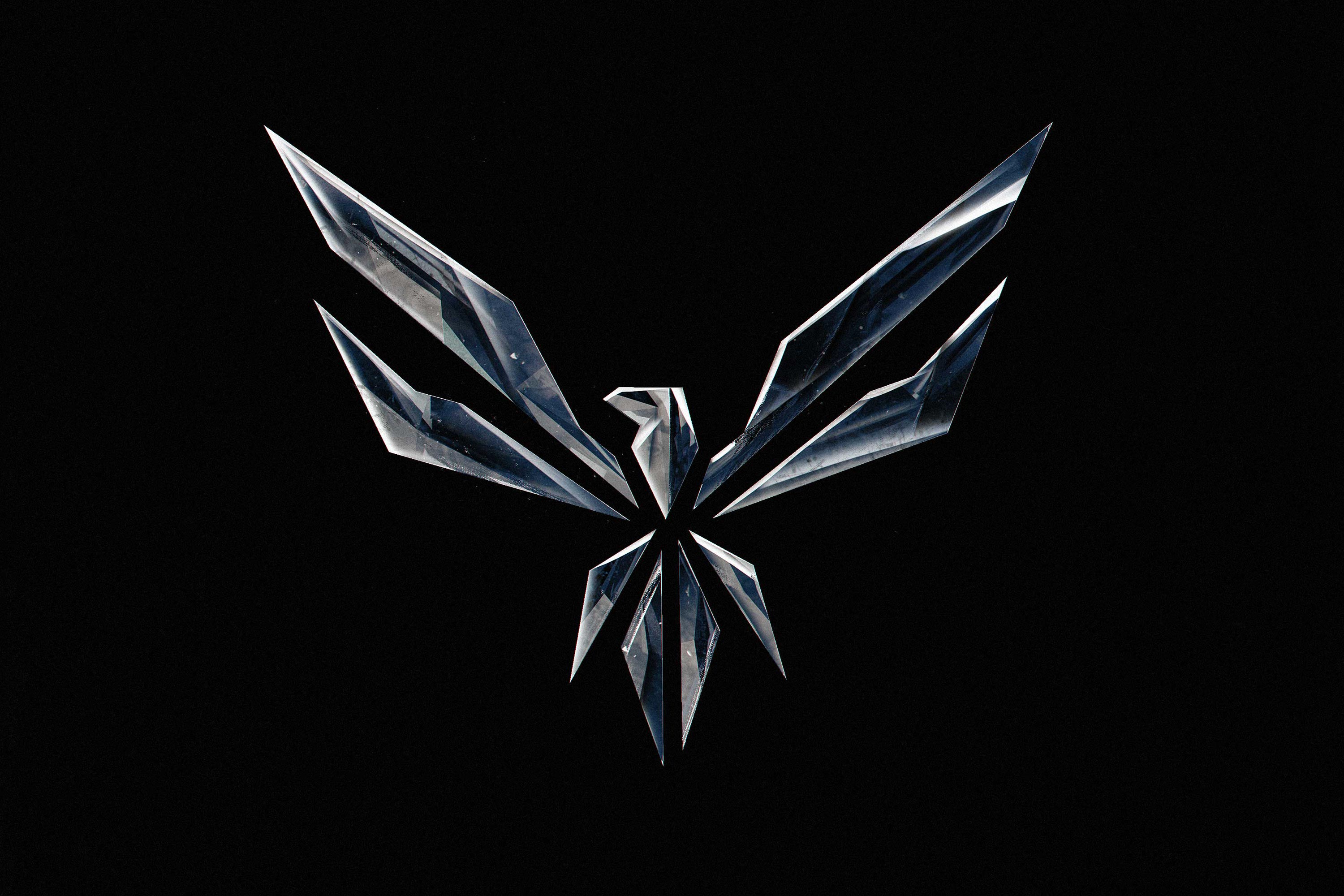
I designed a logo and a website for the distributed video game studio, Black Phoenix Games, in 2021. The logo, a “black” phoenix, is meant to be the opposite of a regular fiery one: cold, sharp, in a perpetual solid state. I looked to crystals/glass, steel, and black holes for inspiration; things in the universe tempered under immense pressure and heat loss. The entropic conclusion of a star. The diligent formation of something special with fortune and skill.
Visit Site ︎
Visit Site ︎

Moodboard excerpt — black quartz, ravens, a black hole, and sculpture by Cornelia Parker made of suspended charcoal.
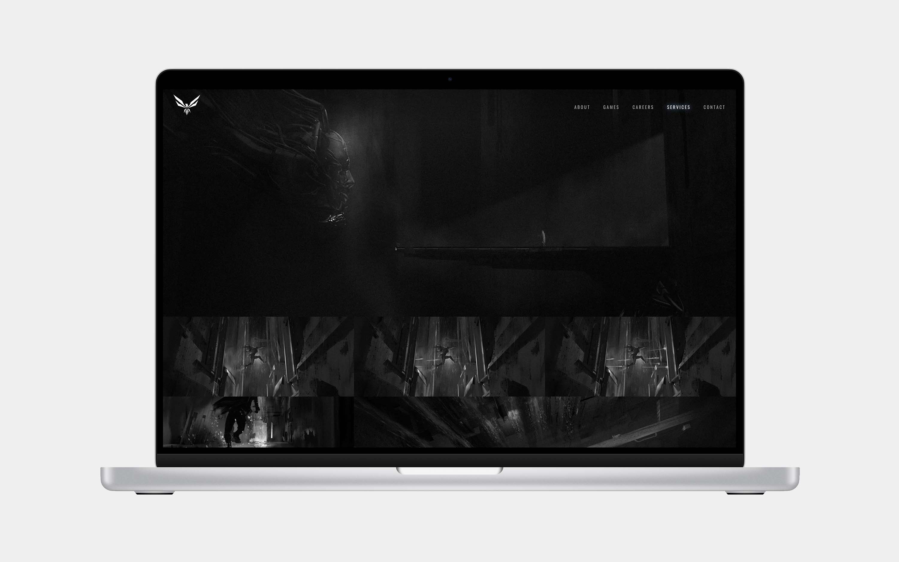
The mark we landed on is a reimagined heraldic eagle shape, which is a very familiar icon with a history that goes back thousands of years. For a phoenix, we almost always see flames as part of the motif but for this mark, I wanted to reference the sharp facets of crystalline structures in the natural world, or shattered glass. There’s a delibrately added illusion to the overall logomark that makes it look like the face of a predatory bird. Finally, the head of the crest can standalone when branding in very small spaces, like for the website’s favicon.


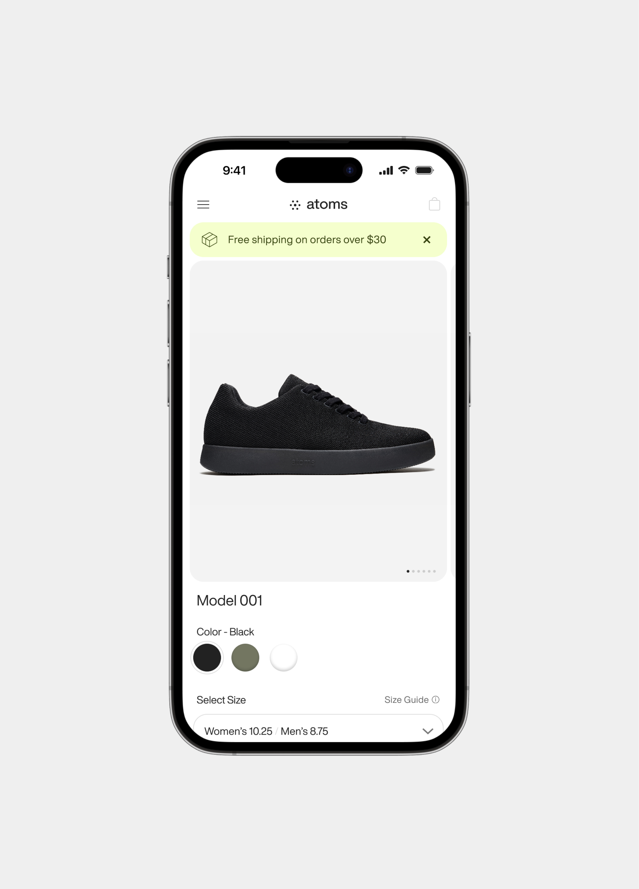
Atoms
2022
2022
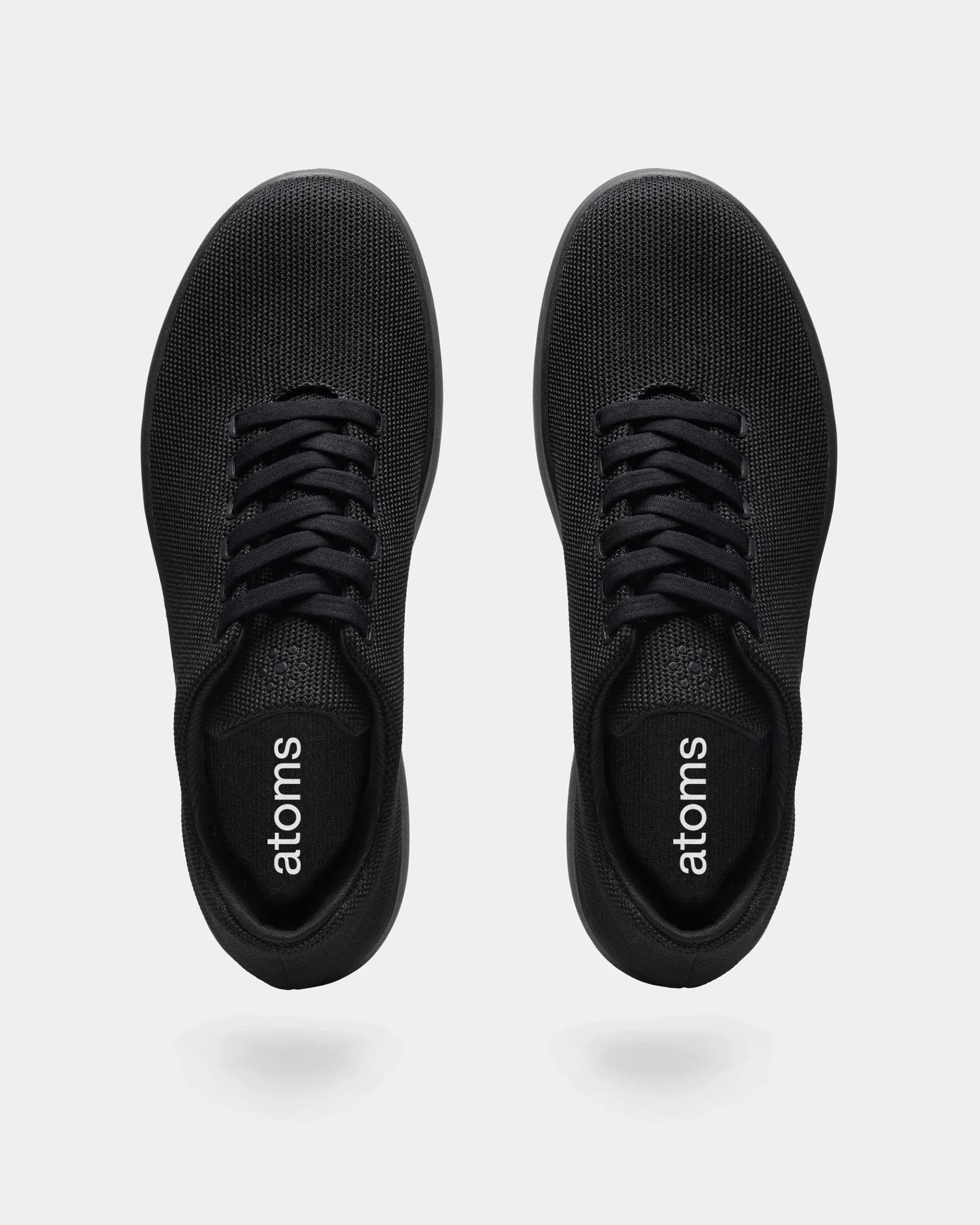
During the busy holiday season of 2021, I joined Atoms, a NYC-based sneaker start-up, full-time as their Senior Designer to plan and execute all graphic design tasks. I completed a rebranding of the entire company, branded a new shoe model, lead creative direction for marketing campaigns, instituted the design system for digital projects, and much more.
Hero image photographer: Julien Roubinet︎︎︎
Hero image photographer: Julien Roubinet︎︎︎
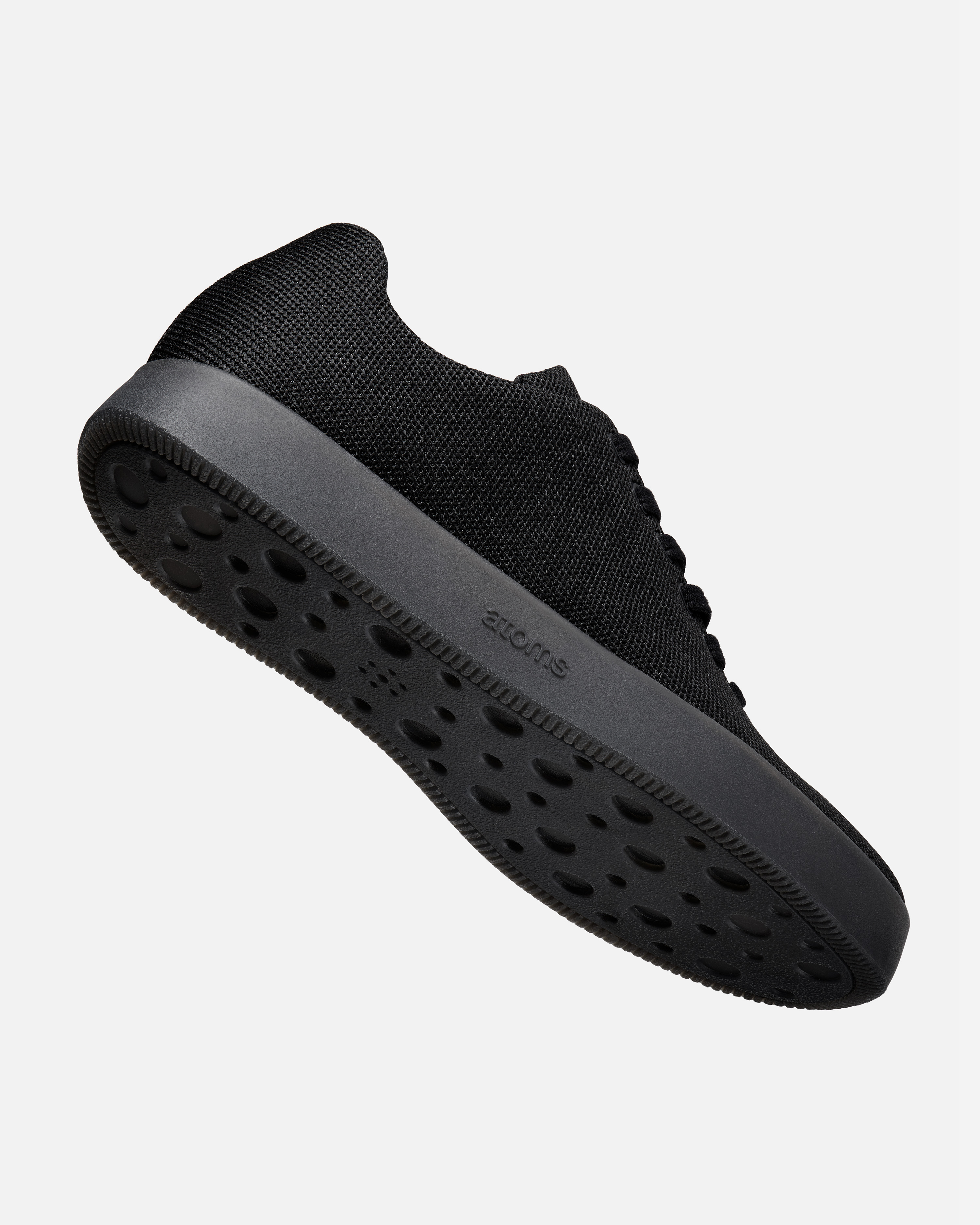
The old logomark in place before I joined Atoms was an interlocked series of loops reminescent of a sacred geometry pattern called “flower of life” — pretty, but, a little complicated and many folks confused it for an icon of a flower. It also was nearly invisible on new outsole materials due to the strokes of the circles not having resilient scalability. In the new logomark, I simply “atomized” the old mark down to the essentials: dots. I wanted it to move from what seemed like a diagram of a part of an atom (the nucleus) to a very minimalist, pluralized abstract of what you might think atoms to be: swirling dots.
Atoms sign in front of the flagship store on 27 Mercer St, New York, NY.
The Atoms logotype accompanying MKBHD’s in Times Square, during the release of Marques Brownlee’s collaboration shoe, Model 251.
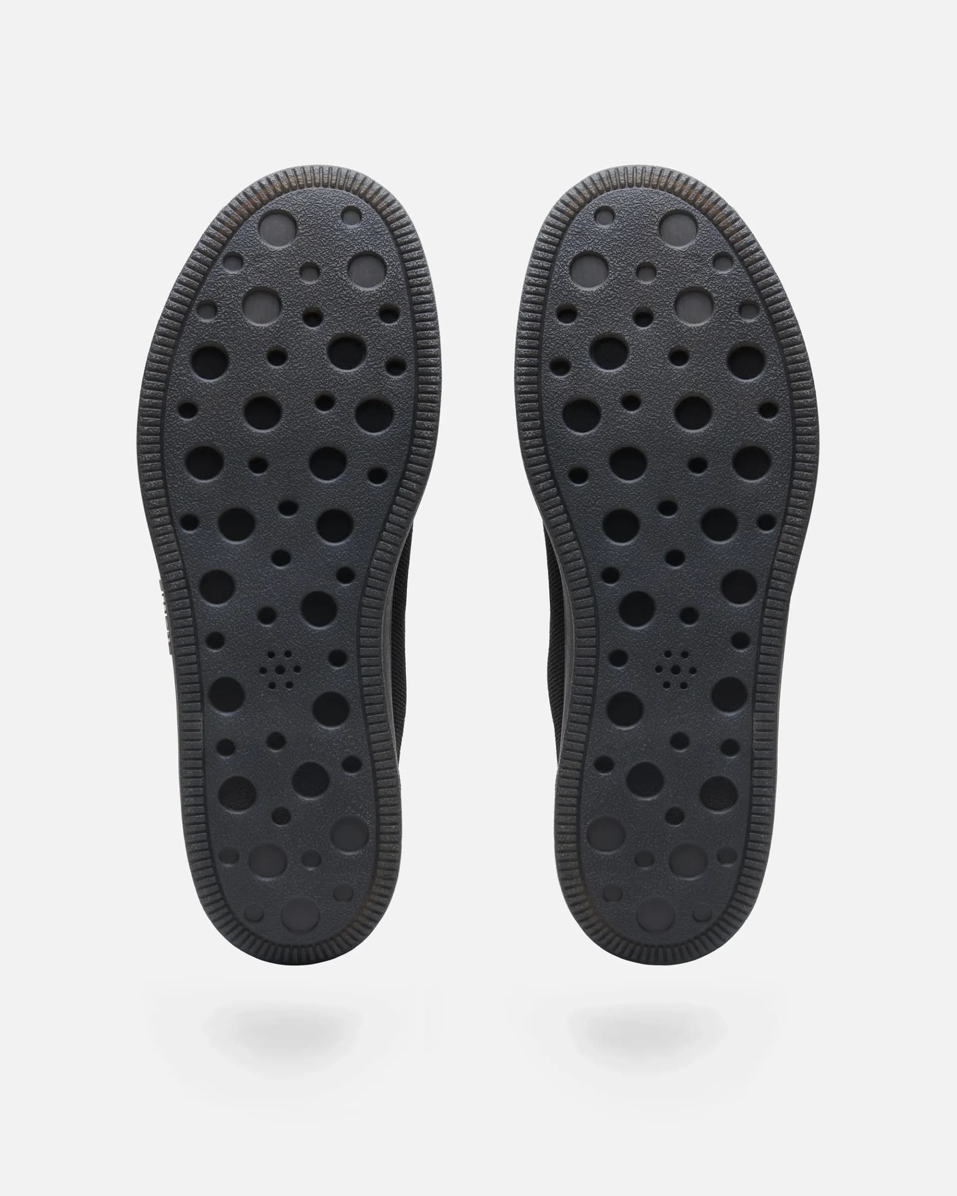
With the new logomark being dots, we also had the option to render it “in void” — that is, hole-punched in various materials. This ensured that it was more visible on places like the bottom of the shoe. I also wanted to make the mark symmetrical; the logomark can be imprinted in dirt or sand without fear of it being flipped.
The new logotype is a slightly modified version of Helvetica Now Display Medium. The exterior of the “o” is a perfect circle with some optical adjustments to the counter, and the tails on the “a” and “t” were made to look more like standing feet.

Alongside the logo, I focused on elevating the brand’s typography. I commissioned the Very Cool font foundry to finish VC Garamond Condensed (which would have remained incomplete had I not reached out) and then utilized it as Atoms’ main headline typeface.


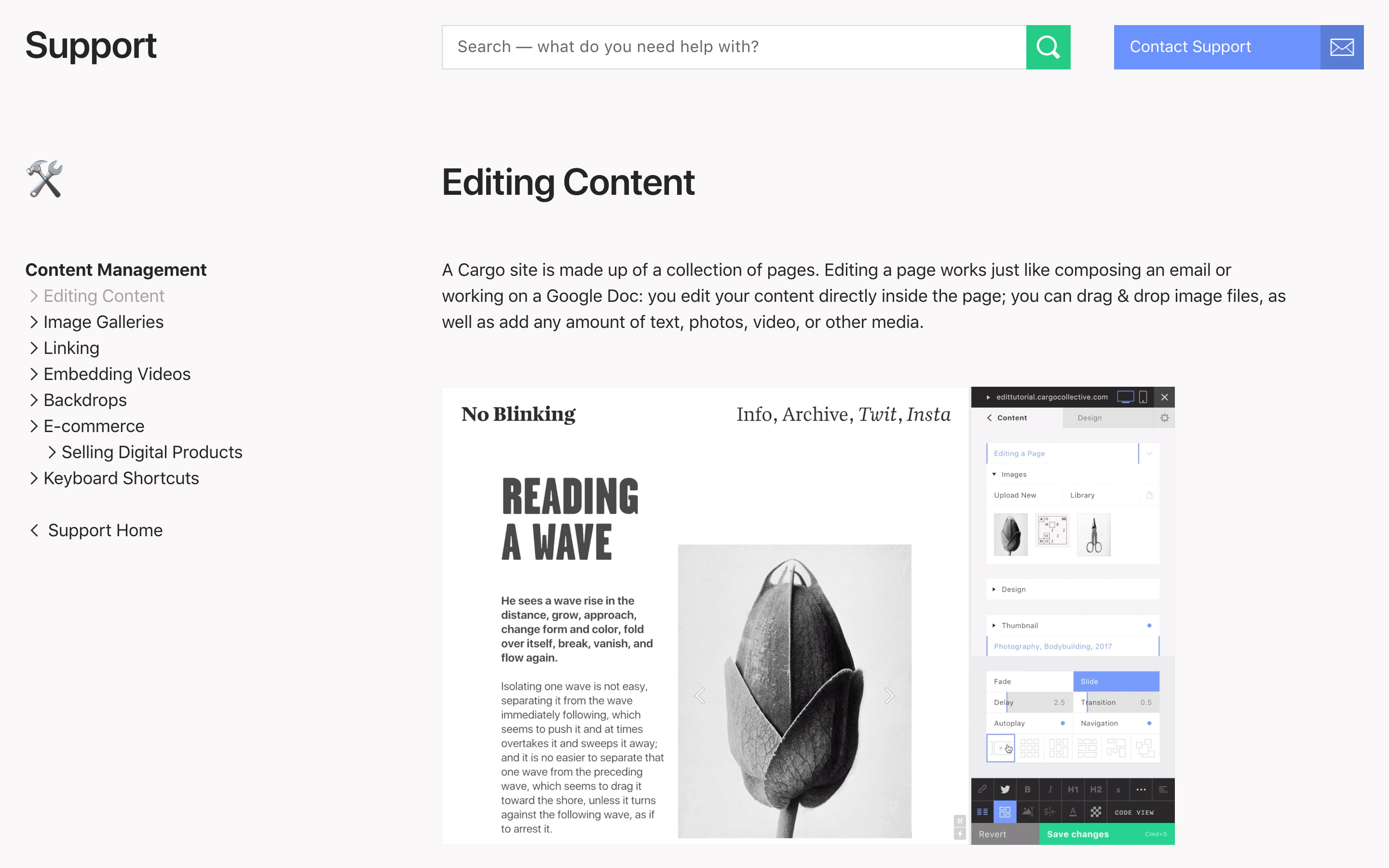
Cargo Collective
2012–2018
2012–2018
In 2012, I officially joined the Cargo team. For almost 7 years after, my work touched all aspects of the platform, the network, and the community. I worked on Cargo 1, Persona, and Cargo 2, as well as two secret projects. Though the visual design of the homepage has changed since I parted ways with the team in 2018, the new tools are still the same, and templates I worked on are still in use.
Visit Site ︎
Visit Site ︎


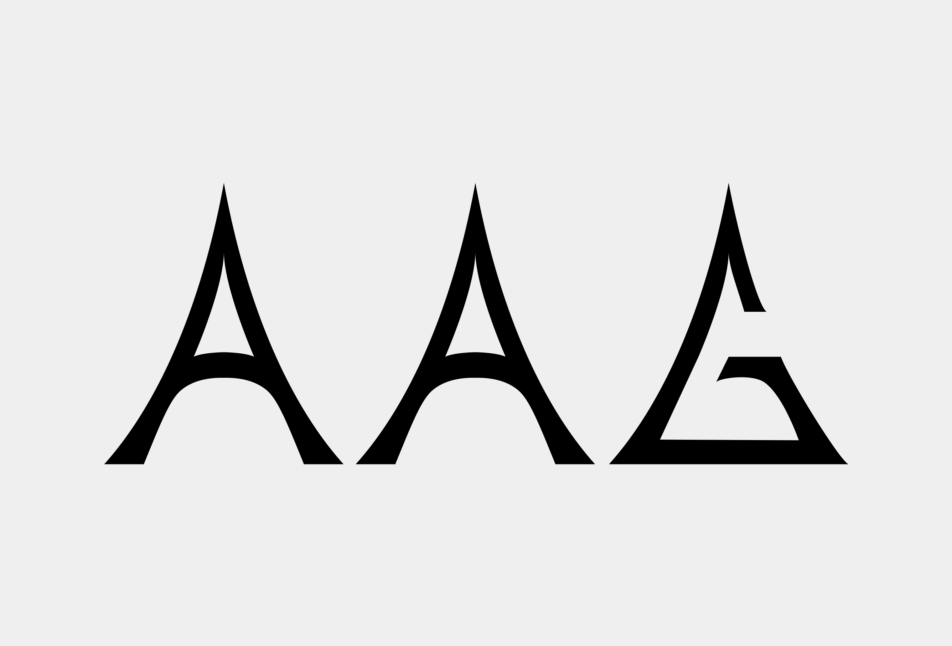
AAG
2021
2021
AAG is both a romanization of the Urdu word for “fire” and an acryonym for “Atoms Art Gallery.” In October 2021, I made the branding for this new art gallery that existed within the headquarters of the Brooklyn-based sneaker start-up Atoms. Knowing the background of the name, I landed on this flared, sharp approach for the letterforms of the logotype — they needed to feel contemporary and carry a bit of a dangerous element to them (my vision was of a flame; how it’s bowed at the base and converges to a point at the top). The other need I wanted to fulfill was a forward-thinking one: AAG could be the vehicle for a higher fashion label or sub-brand of Atoms, so I made sure the logotype would look at home on designer clothing.


atoms.com
2022
2022
Continually throughout 2022, I worked on the Atoms website, and made it utilize an all-new design system for its various e-commerce components. I also lead many efforts to update and produce new creative assets for Atoms products that were inline with the enhanced visual identity we started to cultivate.


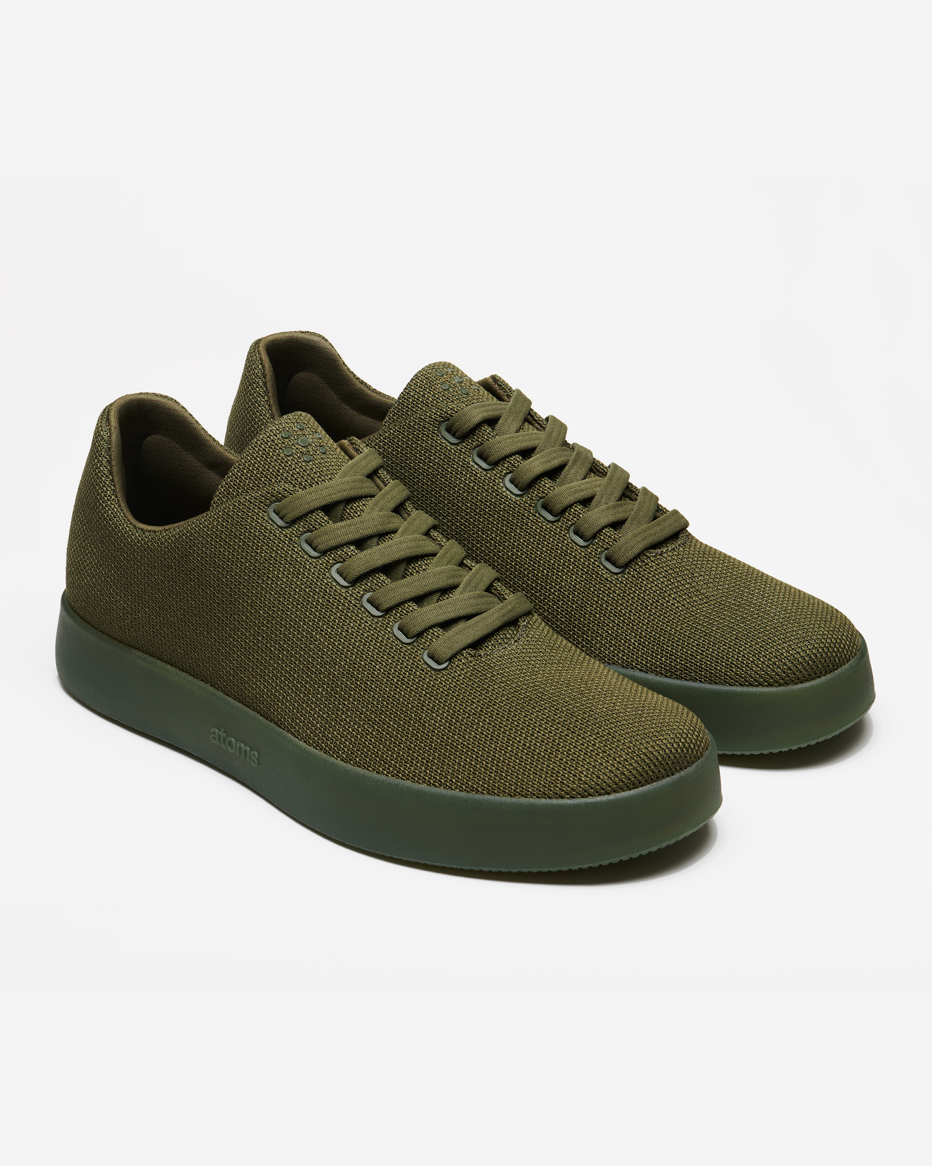
Art direction for new, hi-res product photography and on-model video for use across social, paid media, and product detail pages. In the videos, I aimed to highlight the new shoe’s effortless and flexible t-shirt-like properties.