Atoms
Branding & UI
2021–2022

During the busy holiday season of 2021, I joined Atoms, a NYC-based sneaker start-up, full-time as their Senior Designer to plan and execute all brand design tasks. I completed a rebranding of the entire company, branded a new shoe model, lead creative direction for marketing campaigns, instituted the design system for digital projects, and much more.
Hero image photographer: Julien Roubinet︎︎︎
Hero image photographer: Julien Roubinet︎︎︎
The new logomark is an “atomized” version of the previous, which reduces the overlapping loops to simple dots.
Atoms sign in front of the flagship store on 27 Mercer St, New York, NY.

Atoms website, utilizing an all-new design system for its various e-commerce components.
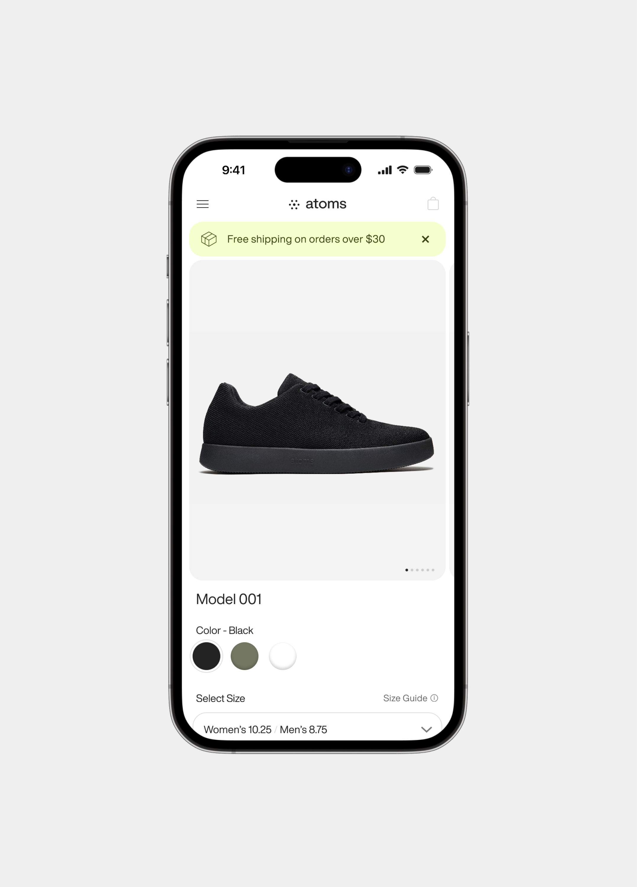
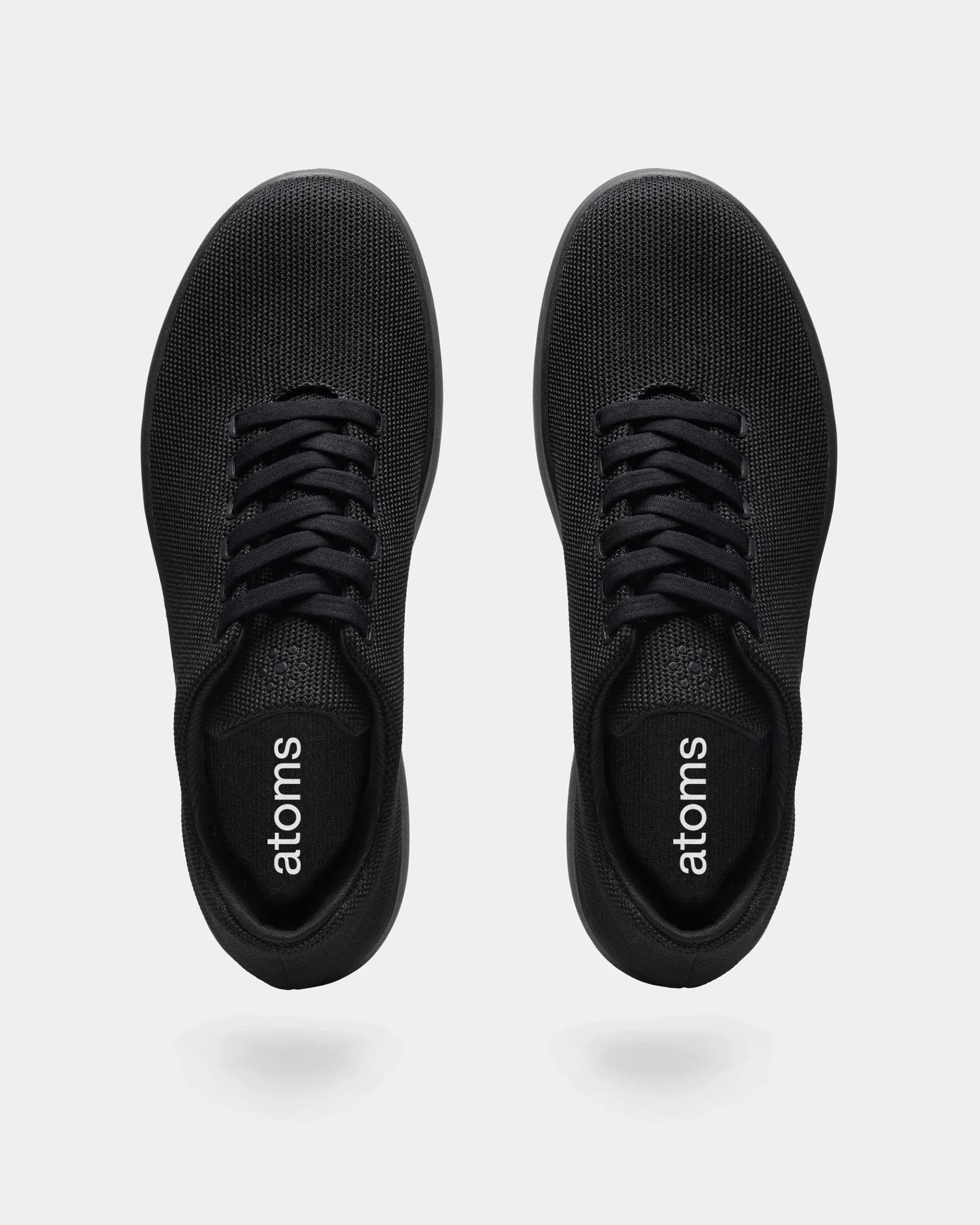
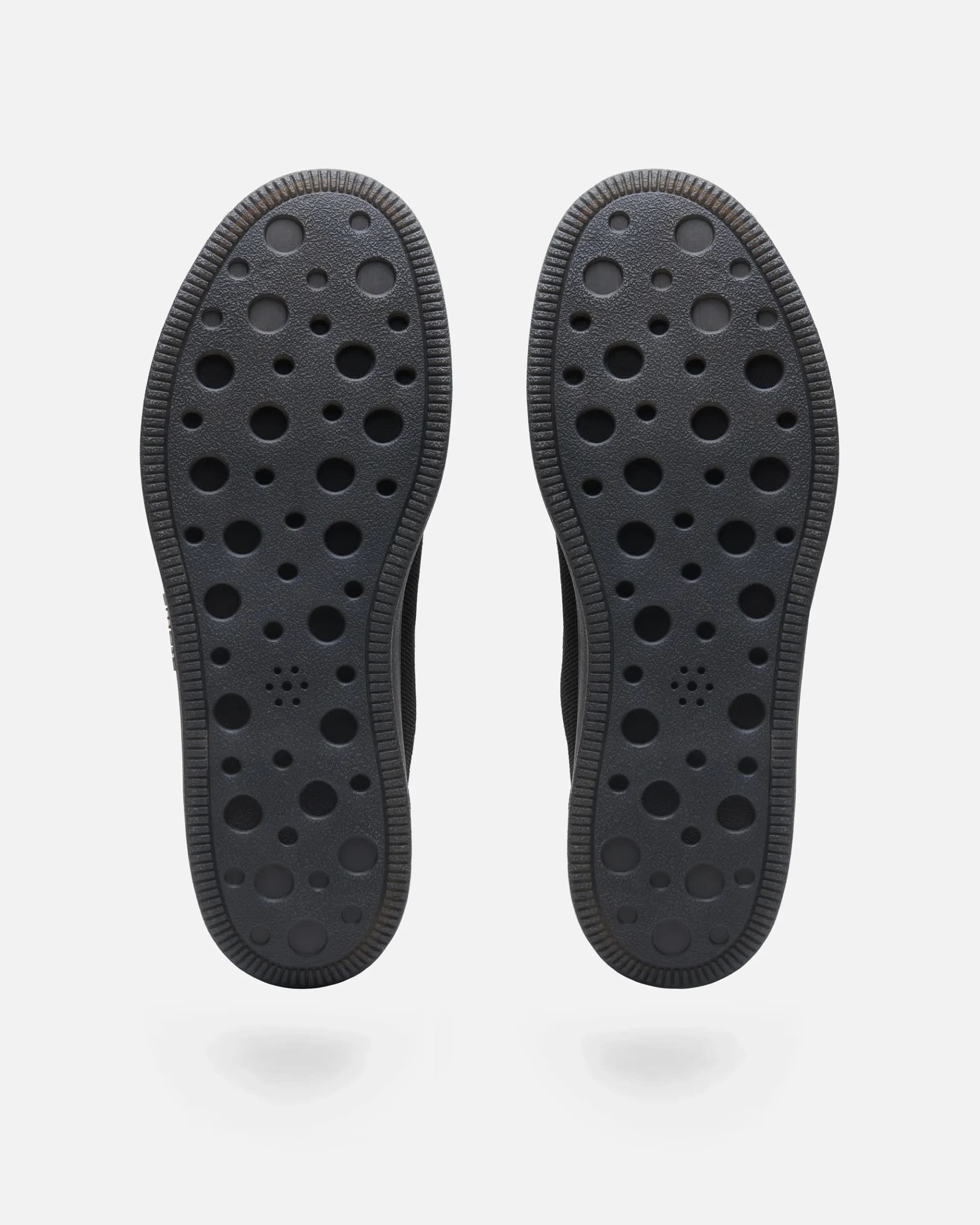
Model 001 product detail video made to highlight its effortless and flexible t-shirt-like properties.
AAG
Visual Identity & UI
2021
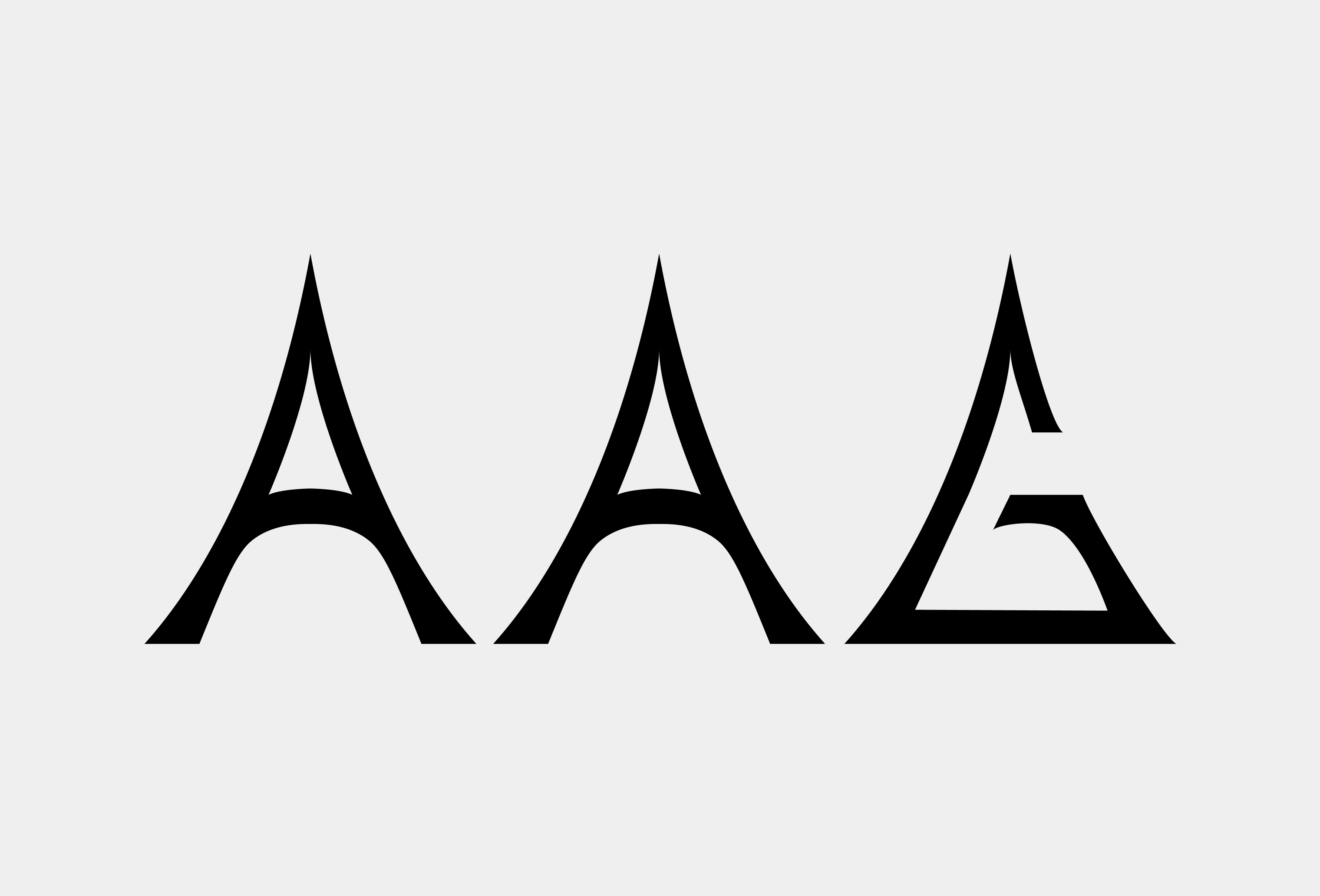
AAG is both a romanization of the Urdu word for “fire” and an acryonym for Atoms Art Gallery. In October 2021, I made the branding for a new art gallery that existed within the headquarters of the Brooklyn-based sneaker start-up Atoms. Knowing the background of the name, I drew this flared, sharp approach for the letterforms of the logotype; in my mind, the letters needed to look contemporary and feel dangerous like a flame.

Black Phoenix Games
Branding & UI
2021
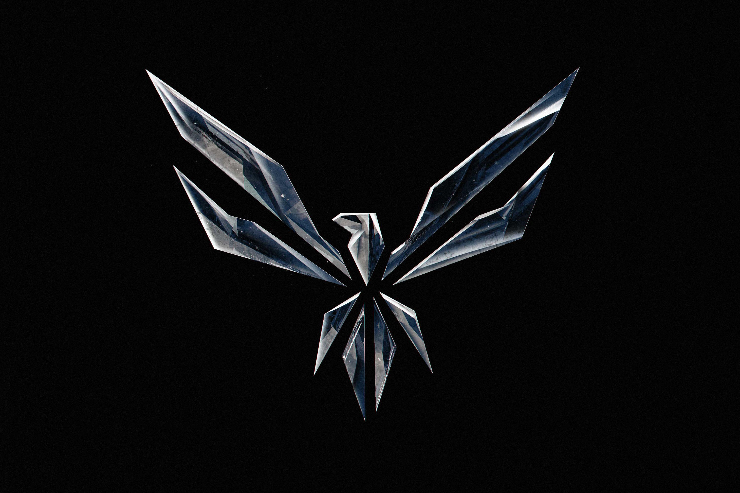
I designed a logo and a website for the distributed video game studio, Black Phoenix Games, in 2021. The logo, a “black” phoenix, is meant to be the opposite of a regular fiery one: cold, sharp, in a perpetual solid state. I looked to crystals/glass, steel, and black holes for inspiration; things in the universe tempered under immense pressure and heat loss. The entropic conclusion of a star. The diligent formation of something special with fortune and skill.
Visit Site ︎︎︎
Visit Site ︎︎︎

Moodboard excerpt — black quartz, ravens, a black hole, and sculpture by Cornelia Parker made of suspended charcoal.
The mark we landed on is a reimagined heraldic eagle shape, which is a very familiar icon with a history that goes back thousands of years. For a phoenix, we almost always see flames as part of the motif but for this mark, I wanted to reference the sharp facets of crystalline structures in the natural world, or shattered glass. There’s a delibrately added illusion to the overall logomark that makes it look like the face of a predatory bird. Finally, the head of the crest can standalone when branding in very small spaces, like for the website’s favicon.
Cargo Collective
Product Design
2012–2018

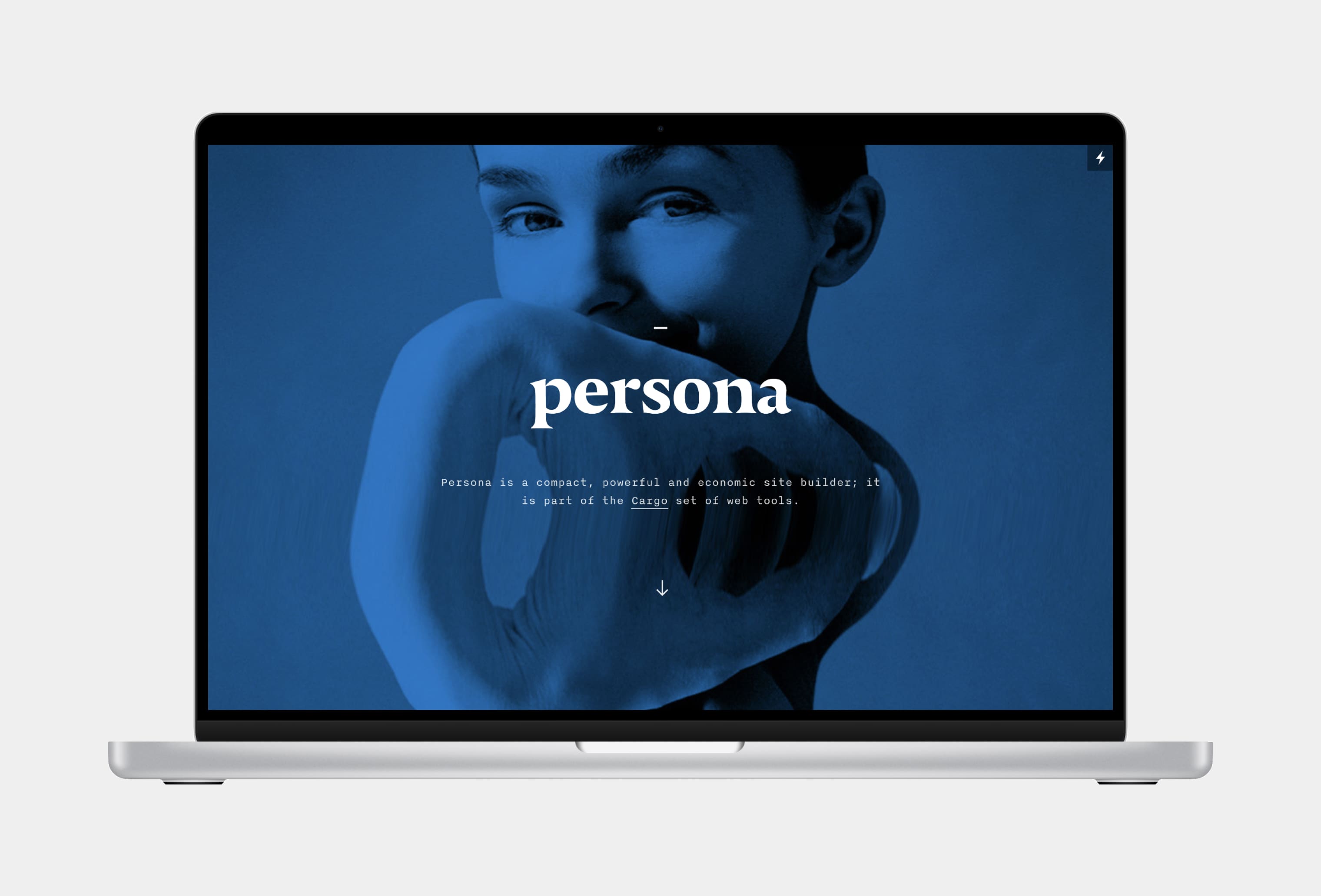
In 2012, I officially joined the Cargo team. For almost 7 years after, my work touched all aspects of the platform, the network, and the community. I worked on Cargo 1, Persona, and Cargo 2, as well as two secret projects. Though the visual design of the homepage has changed since I parted ways with the team in 2018, the new tools are still the same, and templates I worked on are still in use.
Visit Site ︎
Visit Site ︎
Persona

X
X
X
X
X
X